Greenjams
Greenjams is a company in Vizag, India.
innovating sustainable building materials
With the vision to transform the construction industry, Greenjams
creates building materials utilizing industrial waste and crop residue.



The logotype was inspired by the brand philosophy of being unconventional and disruptive.
The leaf acts as a symbol of sustainability amidst the conventional building elements. The disruptive yet sustainable approach of the company is showcased in the symbol.

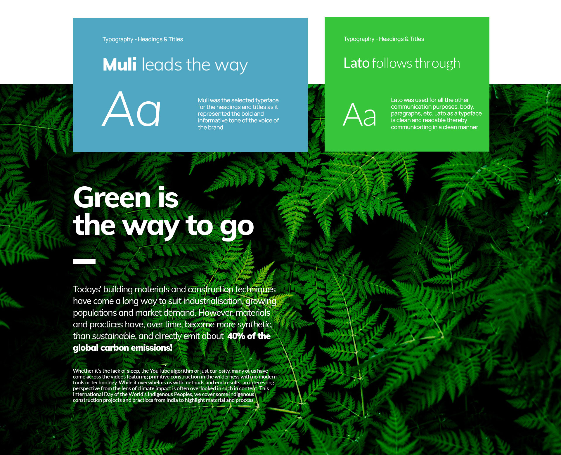
A colour palette was created that could be used across the brand collaterals and other communication platforms.

The colors were arranged in a usage chart. This would help decide their proportion while creating
brand collaterals.
Greenjams has two major products called
Agrocrete & Hempcrete.
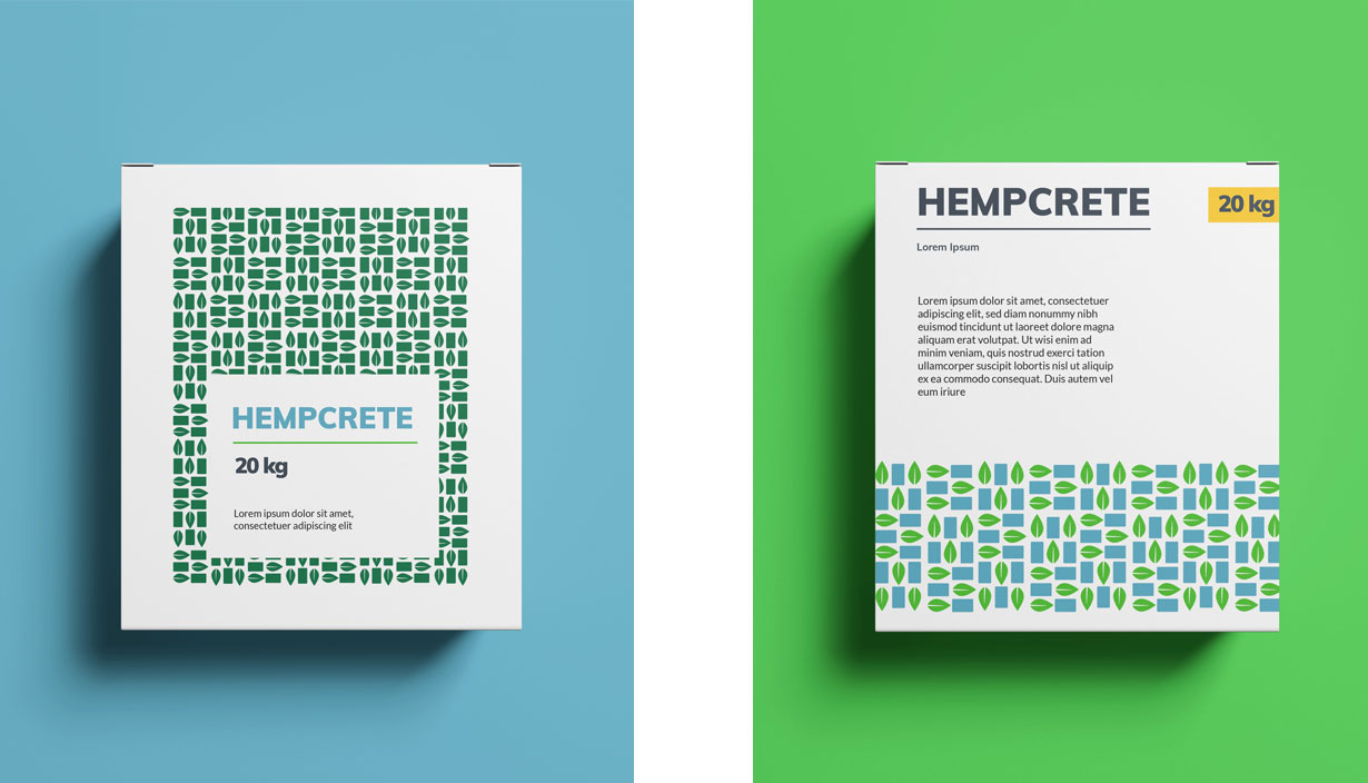
These are bricks and building material produced from crop residue & hemp.
Below are the packaging designs created for these products
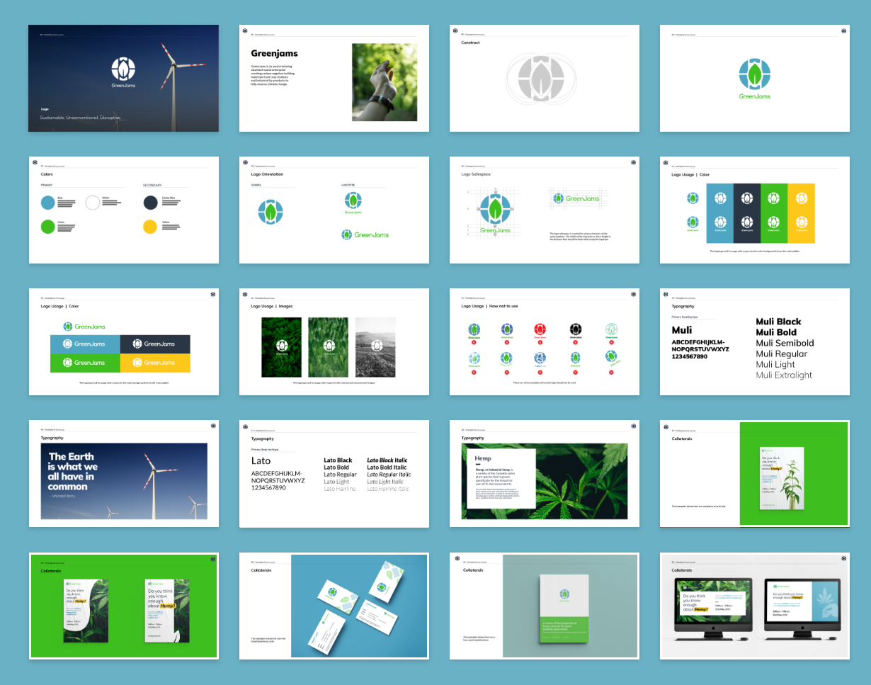
Brand & Layout examples of digital and print collaterals

Brand guidelines and manual
To know more about Greenjams and the cool work they are doing visit - https://www.greenjams.org/
More

Designing a Conversational user experienceConversational UX

A Knowledge Library & Work management tool: Leap WorkbenchProduct & Experience Design